REVIEW
In reviewing the Open Studios, although there was limited constructive feedback, the user testing conducted through the AI-examination revealed generally positive responses. The results showed that many participants still struggled to accurately identify AI-generated images, highlighting the relevance of the issue. Moving forward, the design statement will be revised to target a broader audience, as AI technologies are increasingly being integrated into the everyday lives of people across different age groups and backgrounds.
THINGS TO WORK ON
During the Open Studios, it was pointed out that the design elements lacked consistency. In response, both the CPJ and the Catalog of Making will be redesigned to reflect a more cohesive visual language. As a priority, I decided to start with the Catalog of Making for Semester 2 before moving on to the website redesign. To ensure consistency across all platforms, I chose a white, terminal-inspired minimalistic design that carries a slightly unsettling tone—echoing the aesthetic of the web-based tools developed for the project.
REDESIGN OF THE KIT
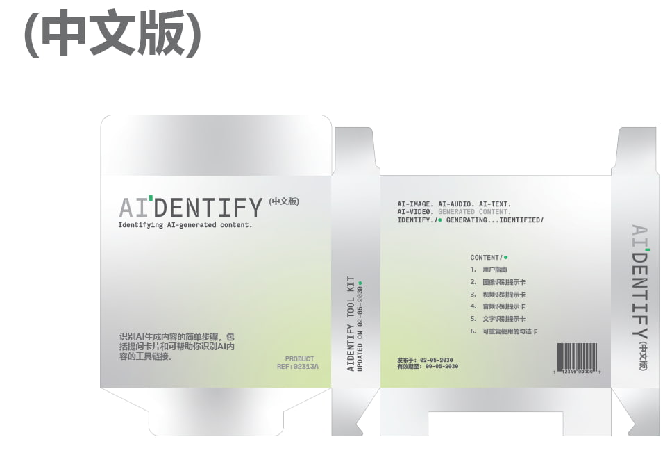
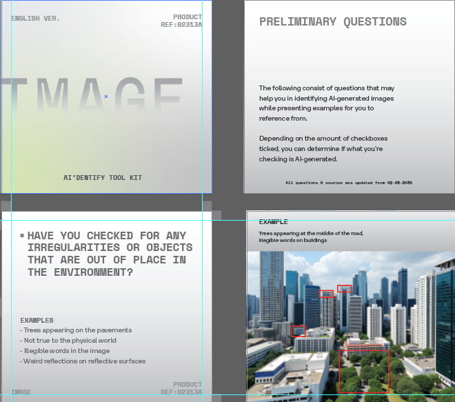
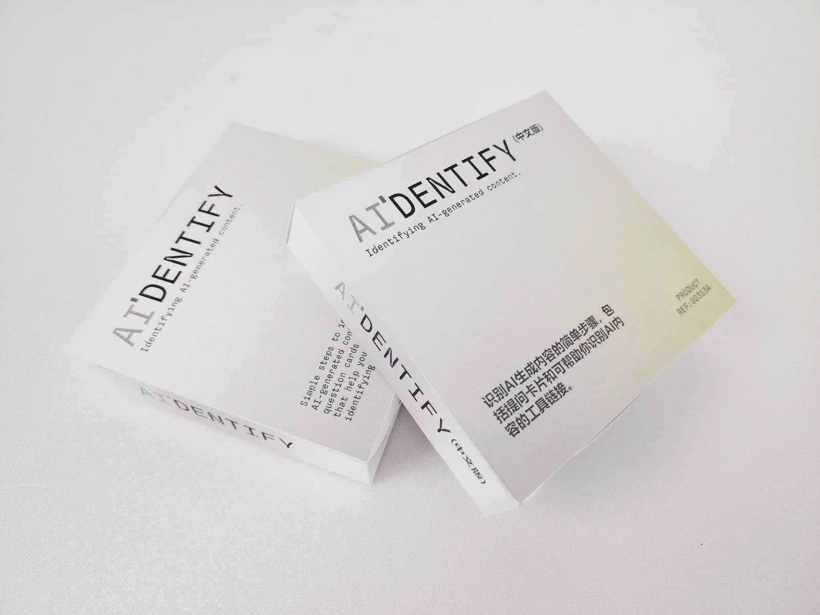
The current design felt disconnected from the rest of the project, likely due to the use of a different typeface from the other collaterals. To address this, I began by revisiting the packaging—keeping the original dimensions but updating the typefaces and background design to better align with the CPJ aesthetic. I incorporated a lime green spot gradient, subtly referencing the act of 'highlighting' or 'identifying' AI-generated content in an increasingly blurred digital age.

While working on the packaging design, I also created an alternative version in Mandarin. This was in response to an observation made during the Open Studios—that the target audience should be broadened. Recognizing that some users may struggle with English, this translated version serves as an initial step toward incorporating multiple languages into the toolkit, making it more accessible and inclusive.
CARDS
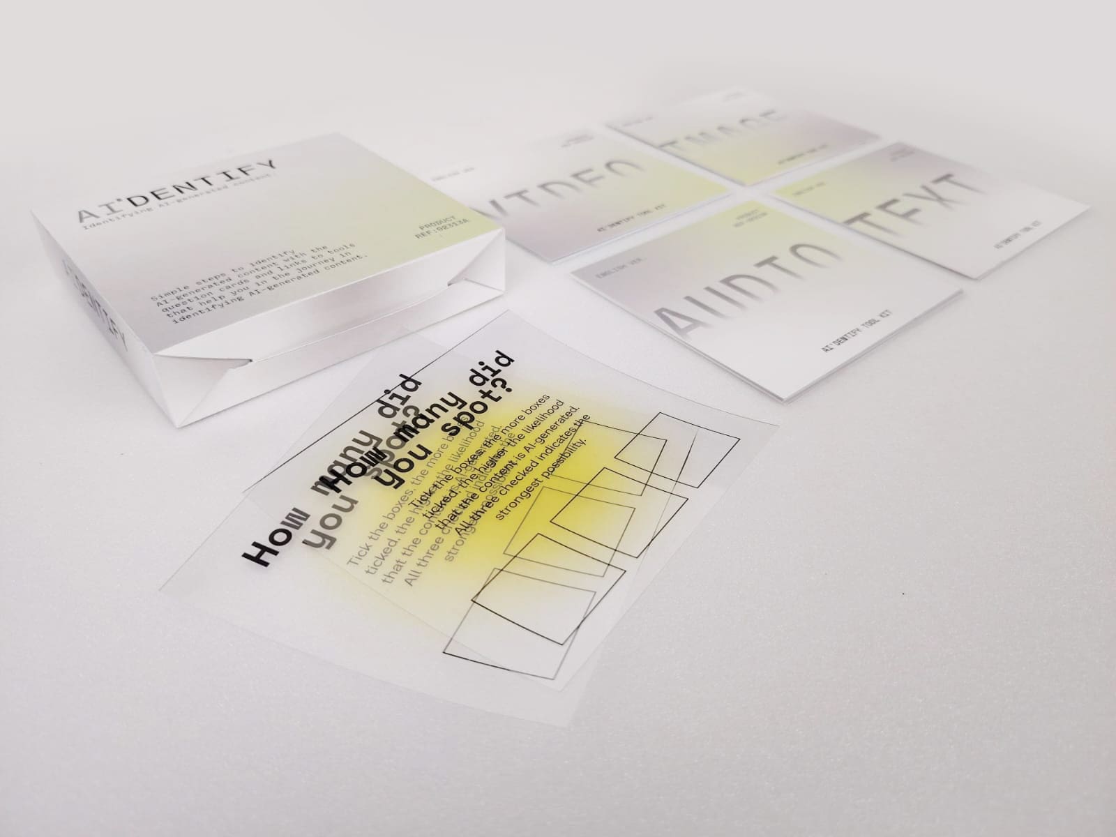
While the packaging box needs redesign, the cards will need to follow the change as well. Hence I replaced the typefaces as well for the cards while retaining the layout the same content. The choice of paper was also updated—this time, the cards will shift from Matte Art Card (240gsm) to Polymatt (190gsm), which offers a smoother, more tactile finish that feels more like traditional playing cards when handled.
REPRINT
Due to a shortage of Polymatt (240gsm), I wasn’t able to use the same paper for the packaging. As an alternative, I chose Munken Lynx, which offered a similarly smooth surface with minimal paper grain—closely matching the texture I was aiming for. However, it would still be better if it was using Polymatt for best result and consistency.
MOVING FORWARD
Moving forward, I focus on documenting the prints and videos for the website, curating the catalog of making to be accessible for both semester 1 and 2 works while keeping a consistent visual identity.